

Ten poradnik jak zawsze będzie podzielony na rozdziały, w których na początku zainstalujemy wtyczkę, następnie pokażę jak tworzyć podstawowe przyciski oraz jak je dostosowywać, potem przejdziemy do zaawansowanego tworzenia przycisków dodając do jednego elementu wiele encji, a na koniec pokażę w jaki sposób tworzyć szablony przycisków, aby dużo łatwiej i szybciej tworzyć kolejne – w ten sposób będziemy mogli robić nasze Dashboardy w spójny stylistycznie panel. W ostatnim etapie pokaże rówineż w jaki sposób oznaczać Niestandardowe Przyciski tych pozycji na Dashboardzie – które wymagają uwagi.
Postanowiłem stworzyć ten poradnik, ponieważ tę wtyczkę chciałbym wykorzystywać w kolejnych filmach, gdzie będę wykorzystywał wiedzę z tego wideo – nie chciałbym aby kolejne filmy były zbyt długie i zawierały zbędne gadanie. Tyle słowem wstępu zaczynamy.
Cały poradnik będzie w głównej mierze bazował na takich sekcjach.
- Instalacja i wyjaśnienie
- Tworzenie przycisków – wyjaśnienie i podstawowe stosowanie
- Zaawansowane tworzenie przycisków – custom_field oraz ostylowanie
- Templates czyli szablony
Wszystkie skrypty wykorzystane w filmie umieszczę również w formie tekstowej na dole tej strony.
Wideo Poradnik
Przykłady i skrypty
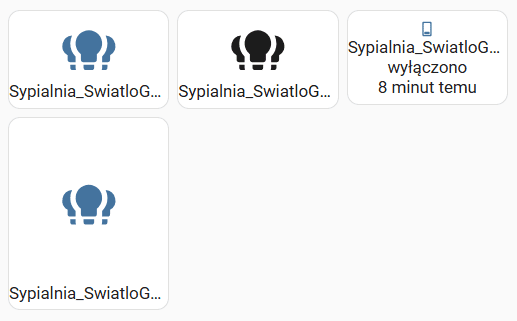
Tutaj chciałem pokazać w jaki sposób stworzyć podstawowych przycisków z wykorzystaniem podstawowych opcji. Przyciski stworzyłem na Siatce.
square: false
type: grid
cards:
  - type: custom:button-card
    entity: switch.sypialnia_swiatlogorne
    icon: mdi:lightbulb-group
    color_type: icon
  - type: custom:button-card
    entity: switch.sypialnia_swiatlogorne
    icon: mdi:lightbulb-group
    color_type: card
  - type: custom:button-card
    entity: switch.sypialnia_swiatlogorne
    color_type: icon
    size: 10%
    show_last_changed: true
    show_entity_picture: true
    show_state: true
  - type: custom:button-card
    entity: switch.sypialnia_swiatlogorne
    icon: mdi:lightbulb-group
    aspect_ratio: 1/1.2
    hold_action:
      action: more-info
    tap_action:
      action: toggle
    double_tap_action:
      action: navigate
columns: 3
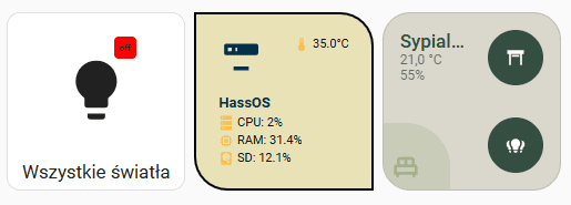
Kolejnym przykładem chciałem pokazać w jaki sposób wzbogacić przycisk o dodatkowe opcje. Możemy na przykład do jednego przycisku dodać parametry związane czy z inną encją czy z innym urządzeniem. Przygotowałem ten przykład również na encji „Siatka”.
square: true
type: grid
cards:
- type: custom:button-card
icon: mdi:lightbulb
aspect_ratio: 1/1
name: Wszystkie światła
styles:
grid:
- position: relative
custom_fields:
notification:
- background-color: red
- border-radius: 20%
- position: absolute
- left: 60%
- top: 10%
- height: 20px
- width: 20px
- font-size: 8px
- line-height: 20px
custom_fields:
notification: |
[[[ return states['switch.wszystkieswiatla'].state ]]]
- type: custom:button-card
entity: sensor.processor_temperature
icon: mdi:server-minus
aspect_ratio: 1/1
name: HassOS
styles:
card:
- background-color: "#eae2b7"
- border-radius: 0px 30px 0px 30px
- padding: 20px
- color: "#111111"
- font-size: 11px
- border: 2px solid black
- text-transform: capitalize
grid:
- grid-template-areas: "\"i temp\" \"n n\" \"cpu cpu\" \"ram ram\" \"sd sd\""
- grid-template-columns: 1fr 1fr
- grid-template-rows: 1fr min-content min-content min-content min-content
name:
- font-weight: bold
- font-size: 13px
- color: "#003049"
- align-self: middle
- justify-self: start
- padding-bottom: 4px
img_cell:
- justify-content: start
- align-items: start
- margin: none
icon:
- color: |
[[[
if (entity.state < 60) return '#003049';
if (entity.state >= 60 && entity.state < 80) return '#f77f00';
else return 'd62828';
]]]
- width: 70%
- margin-top: "-10%"
custom_fields:
temp:
- align-self: start
- justify-self: end
cpu:
- padding-bottom: 2px
- align-self: middle
- justify-self: start
- "--text-color-sensor": >-
[[[ if (states["sensor.processor_use"].state > 80) return "red";
]]]
ram:
- padding-bottom: 2px
- align-self: middle
- justify-self: start
- "--text-color-sensor": >-
[[[ if (states["sensor.memory_use_percent"].state > 80) return
"red"; ]]]
sd:
- align-self: middle
- justify-self: start
- "--text-color-sensor": >-
[[[ if (states["sensor.disk_use_percent_config"].state > 80)
return "red"; ]]]
custom_fields:
temp: |
[[[
return `<ha-icon icon="mdi:thermometer" style="width: 14px; height: 14px; color: #fcbf49;"></ha-icon><span> ${entity.state}°C</span>`
]]]
cpu: |
[[[
return `<ha-icon icon="mdi:server" style="width: 14px; height: 14px; color: #fcbf49;"></ha-icon><span> CPU: <span style="color: var(--text-color-sensor);">${states['sensor.processor_use'].state}%</span></span>`
]]]
ram: |
[[[
return `<ha-icon icon="mdi:memory" style="width: 14px; height: 14px; color: #fcbf49;"></ha-icon><span> RAM: <span style="color: var(--text-color-sensor);">${states['sensor.memory_use_percent'].state}%</span></span>`
]]]
sd: |
[[[
return `<ha-icon icon="mdi:harddisk" style="width: 14px; height: 14px; color: #fcbf49;"></ha-icon><span> SD: <span style="color: var(--text-color-sensor);">${states['sensor.disk_use_percent_config'].state}%</span></span>`
]]]
- type: custom:button-card
entity: sensor.nspanell_analog_temperature1
icon: mdi:bed-double-outline
show_state: true
name: Sypialnia
aspect_ratio: 1/1
tap_action:
action: call-service
service: switch.toggle
data:
entity_id: switch.sypialnia_swiatlogorne
styles:
card:
- padding: 15px
- background: "#dad7cd"
- border-radius: 25px
grid:
- grid-template-areas: "\"n btn\" \"s btn\" \"wilgotnosc btn\" \"i btn2\""
- grid-template-columns: 1fr 1fr
- grid-template-rows: min-content min-content 1fr
name:
- justify-self: start
- align-self: start
- font-size: 17px
- font-weight: 500
- color: "#344e41"
img_cell:
- justify-self: start
- position: absolute
- width: 80px
- height: 80px
- left: 0
- bottom: 0
- margin: 0 0 -20px -20px
- background: |
[[[
if (states['switch.sypialnia_swiatlogorne'].state == 'on') return '#a3b18a';
else return '#a3b18a50';
]]]
- border-radius: 0 40px 0 0
- padding: 0px
icon:
- color: |
[[[
if (states['switch.sypialnia_swiatlogorne'].state == 'on') return '#dad7cd';
else return '#a3b18a';
]]]
state:
- justify-self: start
- align-self: start
- font-size: 12px
- opacity: 60%
custom_fields:
wilgotnosc:
- justify-self: start
- align-self: start
- font-size: 12px
- opacity: 60%
btn:
- justify-self: end
- align-self: start
btn2:
- justify-self: end
- align-self: start
btn3:
- justify-self: end
- align-self: start
custom_fields:
wilgotnosc: |
[[[
return `${states['sensor.smartmi_air_purifier_humidity'].state}%`
]]]
btn:
card:
type: custom:button-card
entity: cover.rzutnik_shutterbox_position
show_name: false
styles:
card:
- background: "#344e41"
- border-radius: 25px
- border: 0px
- width: 50px
- height: 50px
icon:
- color: "#fff"
btn2:
card:
type: custom:button-card
entity: switch.sypialnia_swiatlogorne
icon: mdi:lightbulb-group
show_name: false
styles:
card:
- background: "#344e41"
- border-radius: 25px
- border: 0px
- width: 50px
- height: 50px
icon:
- color: "#fff"
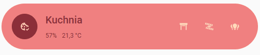
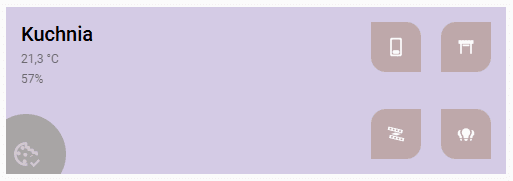
columns: 3Kolejny przykład to kafelek przedstawiający konkretne pomieszczenie. Tym razem przygotowałem panel dla Kuchni, który poza informacją na temat temperatury i wilgotności oraz możliwości wyłączenia światła ma dodatkowe przyciski dla 3 innych urządzeń.
type: custom:button-card
entity: sensor.nspanell_analog_temperature1
icon: mdi:cookie-check-outline
show_state: true
name: Kuchnia
tap_action:
  action: call-service
  service: switch.toggle
  data:
    entity_id: switch.kuchnia_swiatlogorne_l2
styles:
  card:
    - padding: 20px
    - background: "#f08080"
    - border: 0px
    - border-radius: 55px
    - margin-bottom: 50px
  grid:
    - grid-template-areas: "\"i n n btn btn2 btn3\" \"i wilgotnosc s btn btn2 btn3\""
    - grid-template-columns: 0.5fr min-content 1fr 1fr
  name:
    - justify-self: start
    - align-self: start
    - font-size: 20px
    - font-weight: 500
    - color: "#8c2f39"
  img_cell:
    - justify-self: start
    - position: absolute
    - width: 50px
    - height: 50px
    - background: |
        [[[
          if (states['switch.kuchnia_swiatlogorne_l2'].state == 'on') return '#ffdab9';
          else return '#8c2f39';
        ]]]
    - border-radius: 100px
  icon:
    - color: |
        [[[
          if (states['switch.kuchnia_swiatlogorne_l2'].state == 'on') return '#8c2f39';
          else return '#ffdab9';
        ]]]
  state:
    - justify-self: start
    - align-self: start
    - font-size: 12px
    - color: "#8c2f39"
  custom_fields:
    wilgotnosc:
      - justify-self: start
      - align-self: start
      - font-size: 12px
      - color: "#8c2f39"
      - margin-right: 10px
    btn:
      - justify-self: end
      - align-self: start
    btn2:
      - justify-self: end
      - align-self: end
custom_fields:
  wilgotnosc: |
    [[[
      return `${states['sensor.smartmi_air_purifier_humidity'].state}%`
    ]]]
  btn:
    card:
      type: custom:button-card
      entity: cover.rzutnik_shutterbox_position
      show_name: false
      styles:
        card:
          - background: none
          - border-radius: 15px 0
          - border: 0px
          - width: 50px
          - height: 50px
        icon:
          - color: "#ffdab9"
  btn2:
    card:
      type: custom:button-card
      entity: switch.sypialnia_swiatlogorne
      icon: mdi:led-strip-variant
      show_name: false
      styles:
        card:
          - background: none
          - border: 0px
          - width: 50px
          - height: 50px
        icon:
          - color: "#ffdab9"
  btn3:
    card:
      type: custom:button-card
      entity: switch.sypialnia_swiatlogorne
      icon: mdi:lightbulb-group
      show_name: false
      styles:
        card:
          - background: none
          - border: 0px
          - width: 50px
          - height: 50px
        icon:
          - color: "#ffdab9"
type: custom:button-card
entity: sensor.nspanell_analog_temperature1
icon: mdi:cookie-check-outline
show_state: true
name: Kuchnia
aspect_ratio: 3/1
tap_action:
  action: call-service
  service: switch.toggle
  data:
    entity_id: switch.kuchnia_swiatlogorne_l2
styles:
  card:
    - padding: 15px
    - background: "#D4CBE5"
    - border-radius: 0
    - border: 0px
  grid:
    - grid-template-areas: "\"n btn3 btn\" \"s btn3 btn\" \"wilgotnosc btn4 btn\" \"i btn4 btn2\""
    - grid-template-columns: 1fr 1fr min-content
    - grid-template-rows: min-content min-content 1fr
  name:
    - justify-self: start
    - align-self: start
    - font-size: 20px
    - font-weight: 500
    - color: "#000"
  img_cell:
    - justify-self: start
    - position: absolute
    - width: 80px
    - height: 80px
    - left: 0
    - bottom: 0
    - margin: "-20px"
    - background: |
        [[[
          if (states['switch.kuchnia_swiatlogorne_l2'].state == 'on') return '#000';
          else return '#7C7F6580';
        ]]]
    - border-radius: 100px
    - padding: 0px
  icon:
    - color: |
        [[[
          if (states['switch.kuchnia_swiatlogorne_l2'].state == 'on') return '#fff';
          else return '#CFC7D2';
        ]]]
  state:
    - justify-self: start
    - align-self: start
    - font-size: 12px
    - opacity: 60%
  custom_fields:
    wilgotnosc:
      - justify-self: start
      - align-self: start
      - font-size: 12px
      - opacity: 60%
    btn:
      - justify-self: end
      - align-self: start
    btn2:
      - justify-self: end
      - align-self: end
    btn3:
      - justify-self: end
      - align-self: start
      - margin-right: 20px
    btn4:
      - justify-self: end
      - align-self: end
      - margin-right: 20px
custom_fields:
  wilgotnosc: |
    [[[
      return `${states['sensor.smartmi_air_purifier_humidity'].state}%`
    ]]]
  btn:
    card:
      type: custom:button-card
      entity: cover.rzutnik_shutterbox_position
      show_name: false
      styles:
        card:
          - background: "#BEA8AA"
          - border-radius: 15px 0
          - border: 0px
          - width: 50px
          - height: 50px
        icon:
          - color: "#fff"
  btn2:
    card:
      type: custom:button-card
      entity: switch.sypialnia_swiatlogorne
      icon: mdi:lightbulb-group
      show_name: false
      styles:
        card:
          - background: "#BEA8AA"
          - border-radius: 0 15px
          - border: 0px
          - width: 50px
          - height: 50px
        icon:
          - color: "#fff"
  btn3:
    card:
      type: custom:button-card
      entity: switch.kuchnia_swiatlogorne_l2
      show_name: false
      styles:
        card:
          - background: "#BEA8AA"
          - border-radius: 0 15px
          - border: 0px
          - width: 50px
          - height: 50px
        icon:
          - color: "#fff"
  btn4:
    card:
      type: custom:button-card
      entity: switch.kuchnialedy
      icon: mdi:led-strip-variant
      show_name: false
      styles:
        card:
          - background: "#BEA8AA"
          - border-radius: 15px 0 15px 0
          - border: 0px
          - width: 50px
          - height: 50px
        icon:
          - color: "#fff"